B2C
Mobile
Credit Card
Leveraging a 67% drop-off in the primary app to design a new retention-focused product.
Empowering agents to provide financial access to credit-invisible customers through a streamlined, credit-building card solution.
Industry
Fintech
Role
Product Designer, Growth
Owned end-to-end product design
Timeline
Q4 2021 - 4 months project
Went live in February 2022
Team
Product Designer (me), 1 Founder, 1 Data, 2 Product Managers, 4 Engineers
Overview
Context of the application
What Product?
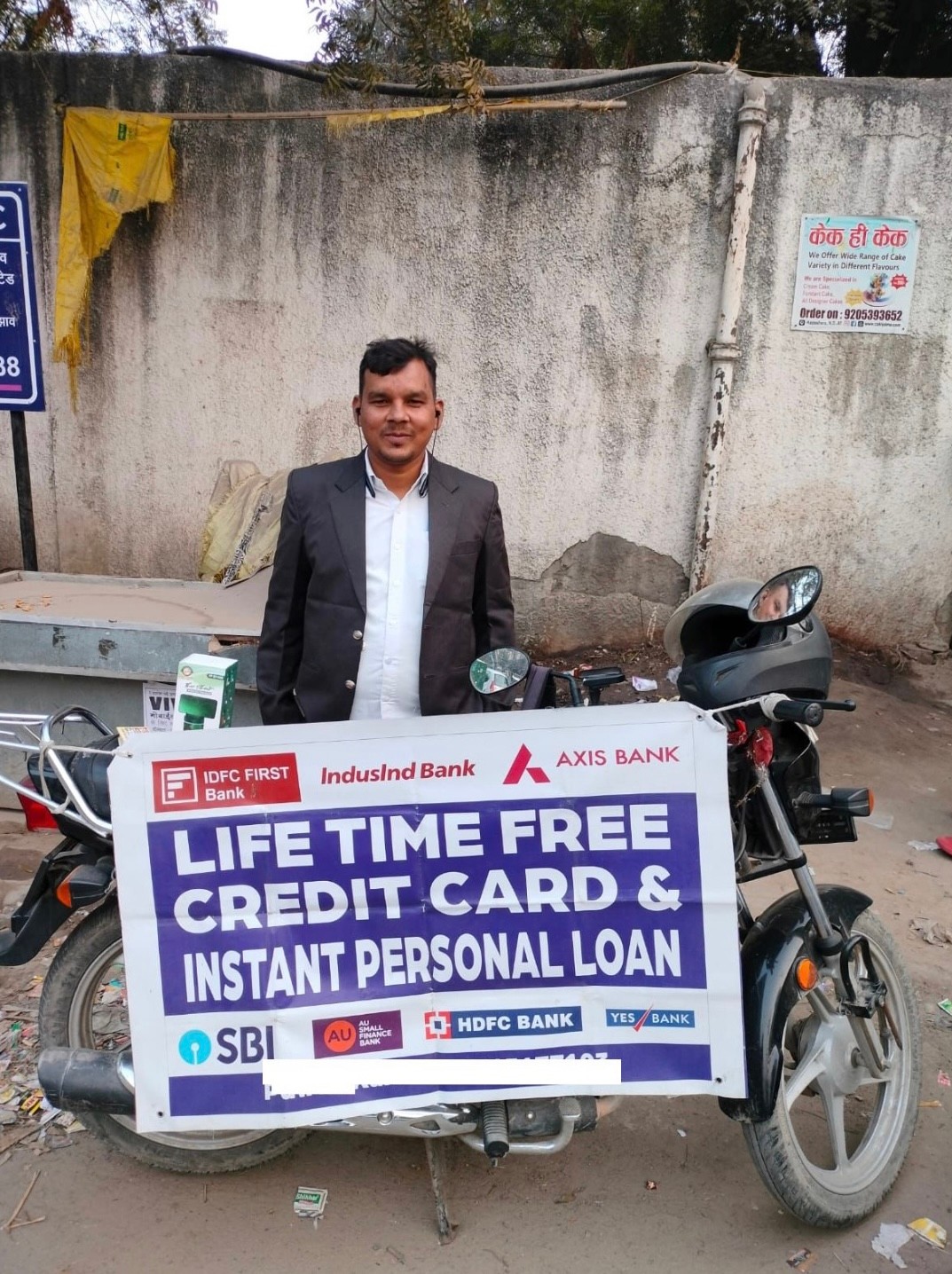
A platform designed for financial agents to educate, promote, and distribute financial products to underserved markets.
Who is it for?
Rural, underserved populations with limited access to essential financial services, including bank accounts, loans, and credit instruments.
Why does it exist?
In India, over 700 million individuals globally remain 'credit invisible,' lacking access to modern financial tools and credit-building opportunities.
Problem
Problem in the Journey


😇
🙂
☺️
😍
😎
😫
33%
67%
1
2
3
4
5
Stages
User Activity
Enter Customer Details
Complete KYC
Check Eligible Products
Share Link
Complete Sale
Illustration of user behavior across typical events
User Problem
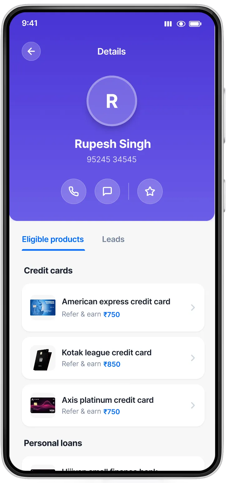
On average, 67% of end customers see zero eligible products in the credit card segment, leading to significant user friction.
Business Problem
This results in substantial revenue loss and erosion of user trust. If left unresolved, it poses a critical risk to the company's sustainability.
Why?
India is a debit-first economy, with a large population lacking credit history, resulting in limited product eligibility.
APPROACh
Balancing User Needs with Business Goals
The core challenge was deciding how much market transparency to provide. Should we show all available credit card options, or focus exclusively on our own product? I explored three approaches to find the right balance.
1
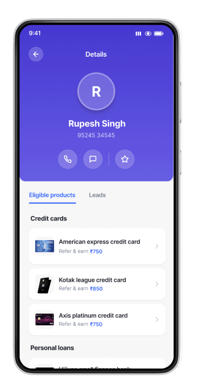
UX-First Approach
Concept: Show all available credit cards from across the market, giving users complete transparency and freedom of choice.
✓ Maximizes user trust through transparency
✓ Empowers users with complete market knowledge
✗ Low conversion to our proprietary product
✗ Users may leave the platform entirely
3
Business-First Approach
Concept: Show only our proprietary credit card, focusing entirely on ecosystem retention and maximizing revenue from our own product.
✓ Maximum focus on proprietary product
✓ Keeps users within our ecosystem
✗ Continues the 67% drop-off problem
✗ Erodes user trust when they're not eligible
2
Balanced Approach — The Sweet Spot
Concept: Highlight our proprietary credit card prominently while still showing competitive alternatives. This maintains transparency while guiding users toward our ecosystem.
✓ Builds trust through market transparency
✓ Guides users to our product without forcing
✓ Higher conversion while maintaining user satisfaction
✓ Reduces drop-off by showing alternatives when our product isn't eligible
Why this won: This approach reduced the 67% drop-off significantly by ensuring users always saw relevant options, while still achieving strong conversion to our proprietary product through strategic prominence and positioning.
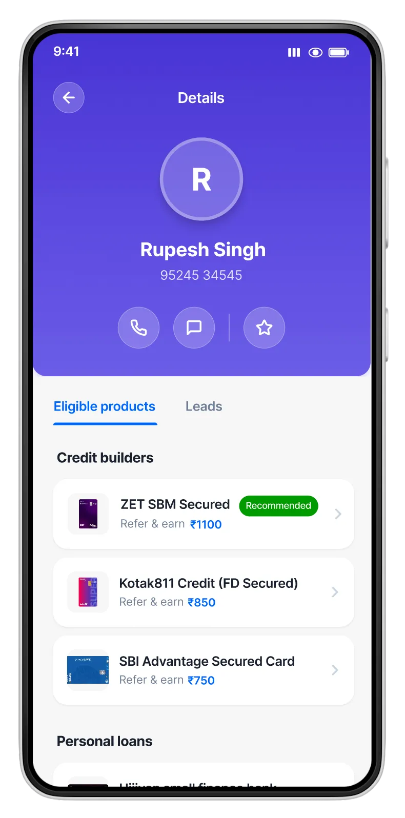
✓ Selected Approach
Illustration of user behavior across typical events
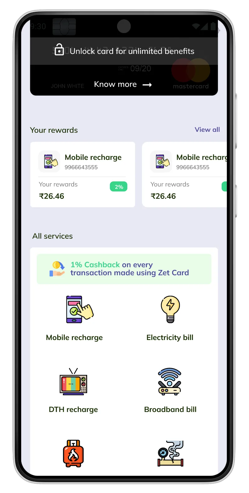
final design
From Drop-off to Opportunity
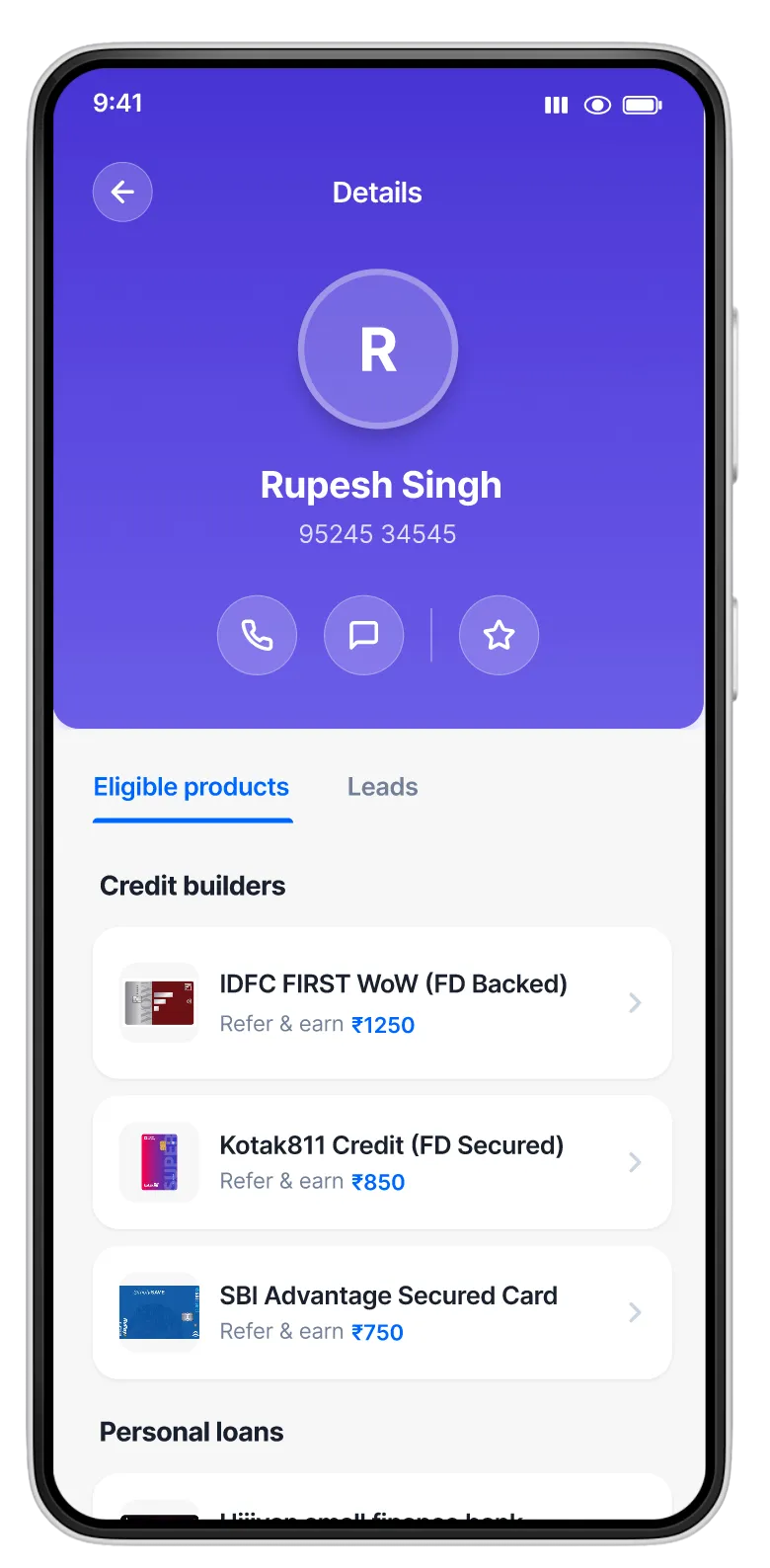
Instead of leaving 67% of users empty-handed, we transformed the moment of ineligibility into an opportunity for credit building, creating a win-win for users and business.
The Transformation
Before
Dead End Experience
• No credit builder options available
• 67% of users hit this dead end
• Zero pathway to credit building
• Massive drop-off and lost revenue
After
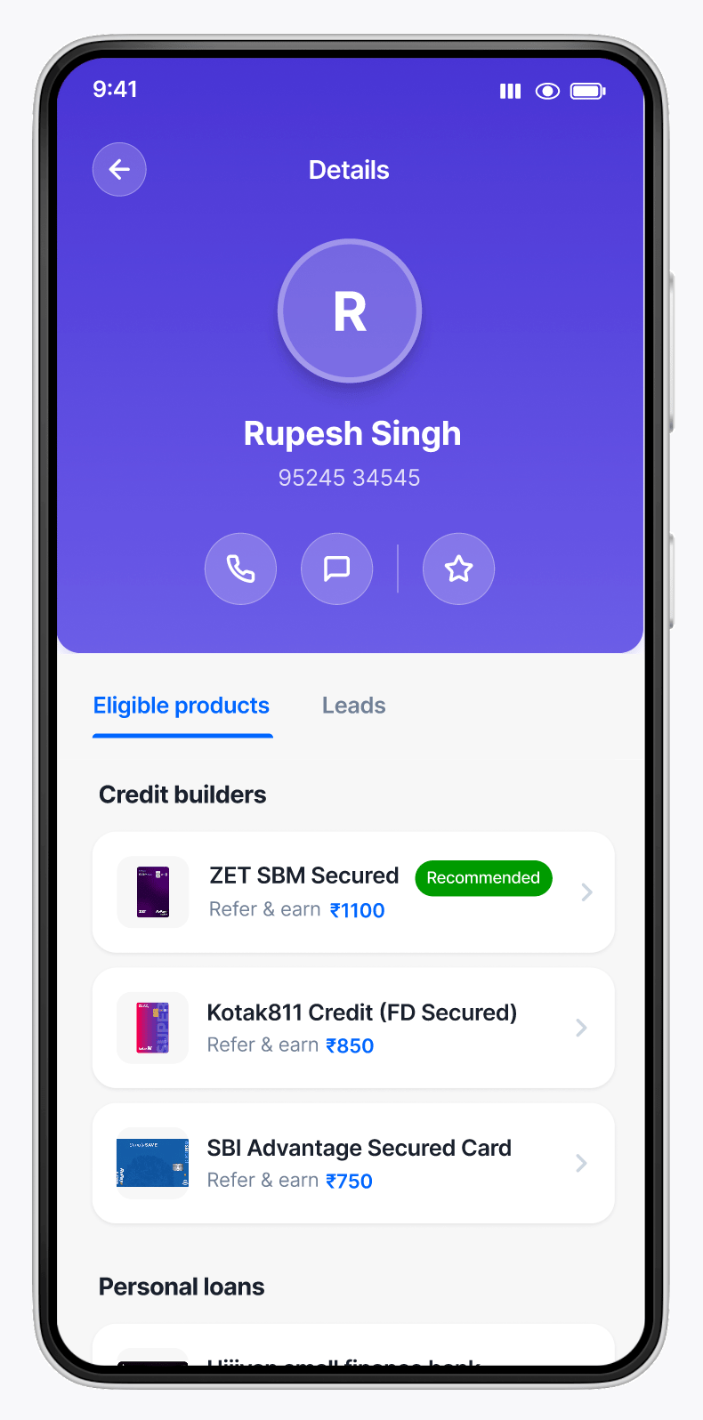
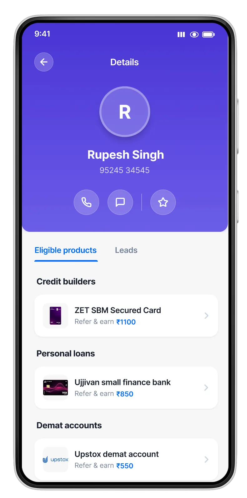
Credit Builder Opportunity
• Secured credit cards for credit building
• Pathway to establish credit history
• Alternative options always visible
• Reduced drop-off, increased trust
design process
Turning a Problem into an Opportunity
When 67% of users hit a dead-end, we saw an opportunity to build something new, a credit-building pathway that would serve both users and business goals. Here's how we transformed this drop-off into a new product offering.
01
Problem Discovery
Analyzed user behavior data and identified that 67% of users were dropping off when checking for eligible credit card products. This massive friction point was costing us revenue and trust.
Data Analysis
User journey tracking & drop-off rates
Stakeholder Interviews
Understanding business constraints
02
Understanding Credit-Invisible Users
Dove deep into why users were ineligible. Discovered that India's debit-first economy left millions without credit history, making them "credit-invisible" and unable to access traditional credit products.
User Research
Agent interviews & customer profiles
Market Analysis
Credit landscape & secured card options
03
Exploring Solutions
Collaborated with product and business teams to explore multiple approaches. The key question: How much transparency should we provide while still driving business value? This led to three distinct design directions.
Approach 1
Full market transparency
Approach 2 ✓
Balanced guidance
Approach 3
Business-first focus
04
Designing the Credit Builder Pathway
Created a new product experience featuring secured credit cards (FD-backed) for credit-invisible users. Designed the UI to prominently feature our proprietary solution while maintaining transparency with market alternatives.
Wireframing
Information architecture & card hierarchy
Visual Design
High-fidelity mockups & prototypes
05
Testing & Iteration
Conducted UAT sessions with financial agents to validate the experience. Iterated on messaging, card prominence, and information clarity based on feedback to ensure the solution was both intuitive and effective.
User Testing
Agent feedback & usability sessions
Iterations
Refinements based on real-world usage
06
Launch & Impact
Shipped the new credit-building feature in February 2022. The solution successfully reduced drop-off by 18% in the first month, increased secured card conversions by 3.2x, and achieved an 89% user satisfaction score.
Result
Transformed drop-off into opportunity
launch
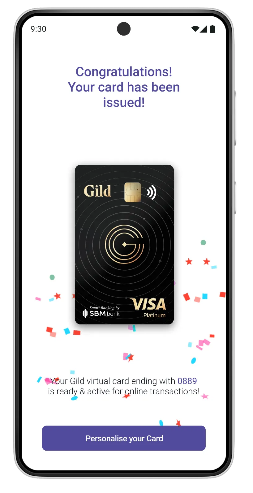
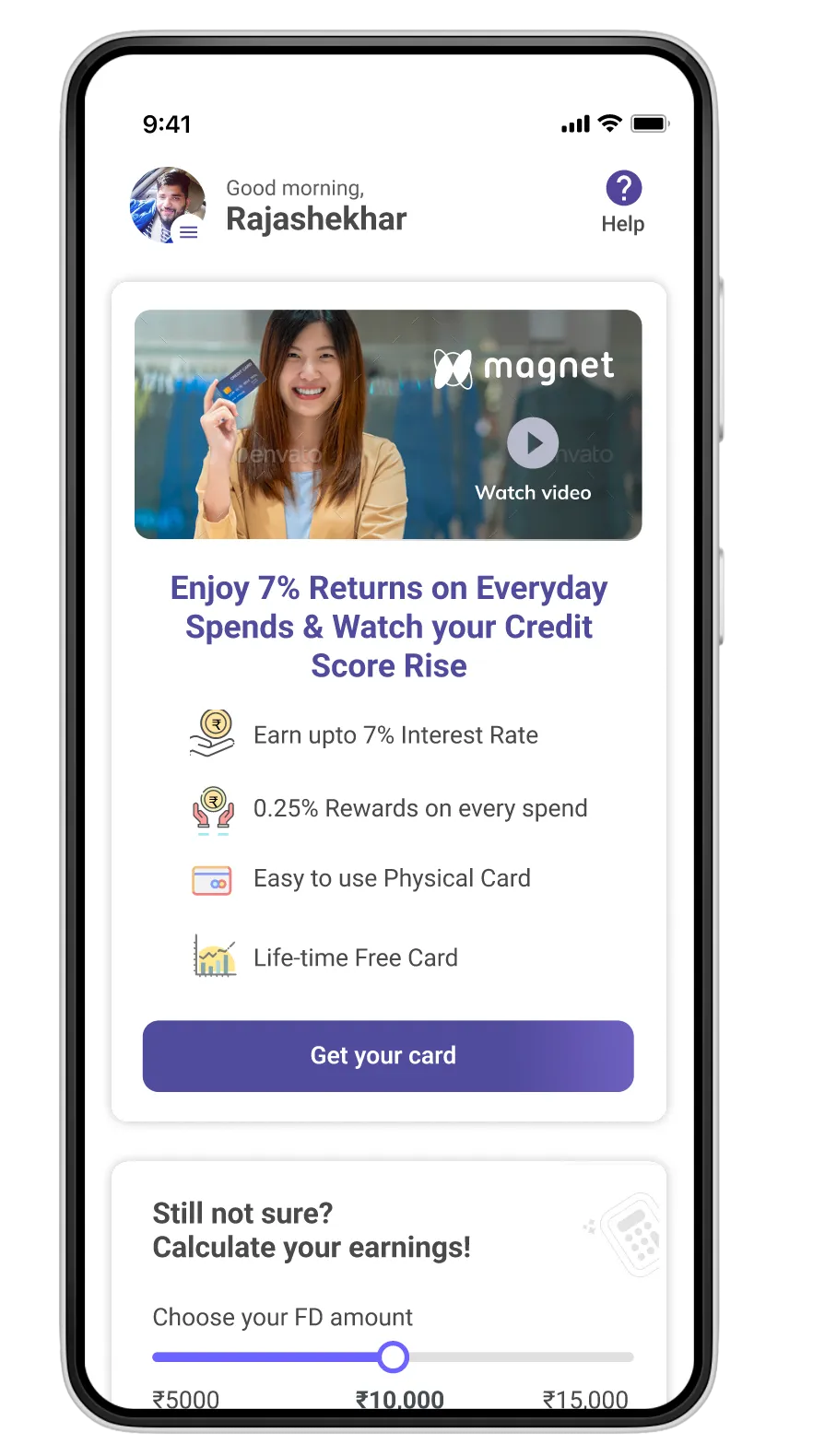
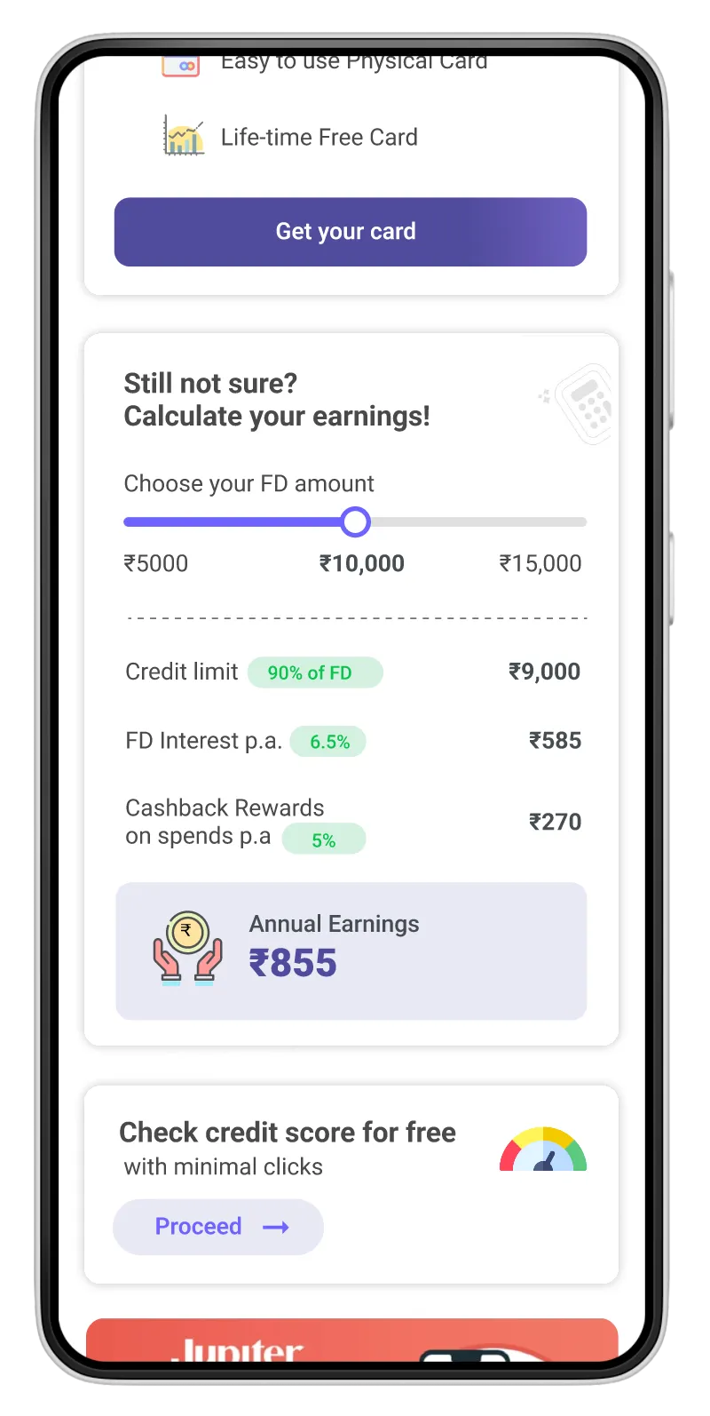
Introducing the Credit Builder App
In February 2022, we launched a dedicated credit-building experience as a strategic solution to our drop-off problem. This wasn't just a feature update. It was a new product offering that transformed how we serve credit-invisible users.
What We Launched

Secured Credit Card Product
FD-backed credit card (ZET SBM) for users with no credit history, enabling them to build creditworthiness from scratch.

Smart Product Hierarchy
Redesigned card selection UI with strategic placement and transparent alternatives to guide without forcing.

Educational Content
In-app guidance explaining credit building, eligibility, and the benefits of secured cards to first-time users.
Launch Strategy
PHASE 1
Pilot with Top Agents
Rolled out to 50 high-performing agents for initial feedback and refinement.
PHASE 2
Gradual Rollout
Expanded to 500+ agents across 3 regions, monitoring conversion and feedback closely.
PHASE 3
Full Launch
Company-wide release to 5,000+ agents nationwide with full marketing support.
alpha version
D
Version Alpha 4
FD Calculator Focus
Highlighted the FD-backed card calculator and credit score features. This was a step closer to the solution but felt too transactional, missing the educational and trust-building elements.
✓ What Worked
Clear utility value and practical tools
✗ What Didn't
Lacked educational context and trust-building
C
Version Alpha 3
Partner Card Branding
Featured partner branding (like Magnet) prominently with video content. This tested well but didn't solve the user trust and brand recognition problem.
✓ What Worked
Strong visual hierarchy and clear product focus
✗ What Didn't
Didn't address the core “why” for 67% drop-off issue
B
Version Alpha 2
Dark Mode Experiment
Tested a dark interface with icon-based service navigation. Agents found it visually appealing but struggled with icon recognition, especially in rural areas with lower digital literacy.
✓ What Worked
Modern, premium feel that elevated brand perception
✗ What Didn't
Icon comprehension issues in rural markets
A
Version Alpha 1
Rewards-First Approach
Emphasized user rewards and benefits at the top of the home screen. While this created excitement, it buried the core financial services too deeply in the hierarchy.
✓ What Worked
Strong emotional engagement and excitement around benefits
✗ What Didn't
Core services not immediately visible to agents
Early Explorations & Alpha Designs
Before arriving at the final credit-builder solution, we explored multiple interface concepts and information architectures. These alpha versions helped us test different approaches to card presentation, rewards integration, and financial services hierarchy.
Alpha Design Iterations
final designs
After extensive research, testing, and iteration, we launched the final credit builder application. This solution seamlessly integrated into the agent workflow while providing a clear path for credit-invisible users to build their financial future.
The Complete Credit Builder Experience
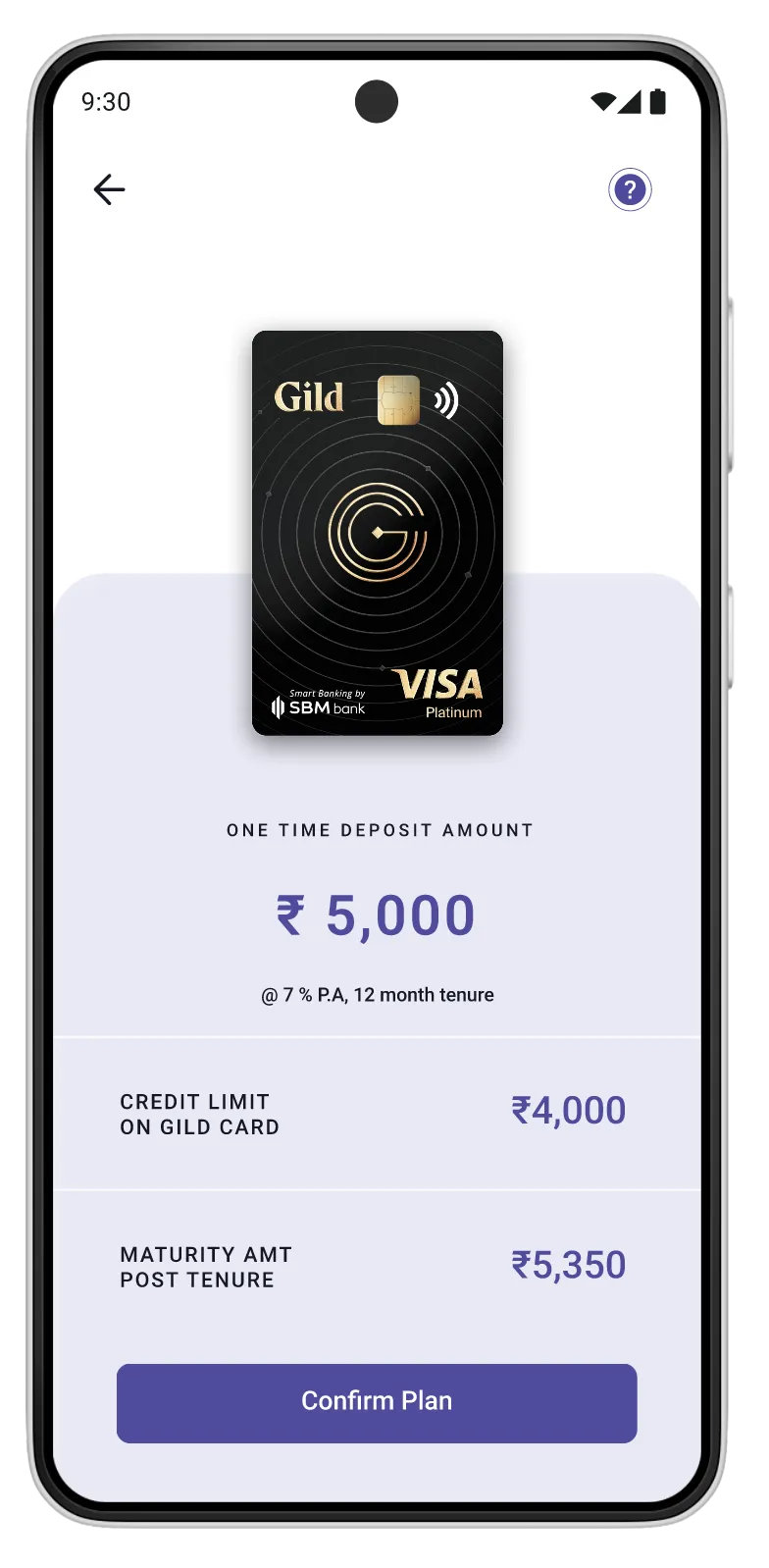
1
Card Selection
Choose Your FD-Backed Card
Users select their desired credit limit which determines the FD amount needed. The interface clearly breaks down the FD deposit, joining fee, and resulting credit limit, eliminating confusion and building trust through transparency.
Design Focus
Clear pricing breakdown with no hidden fees
User Benefit
Informed decision-making from the start
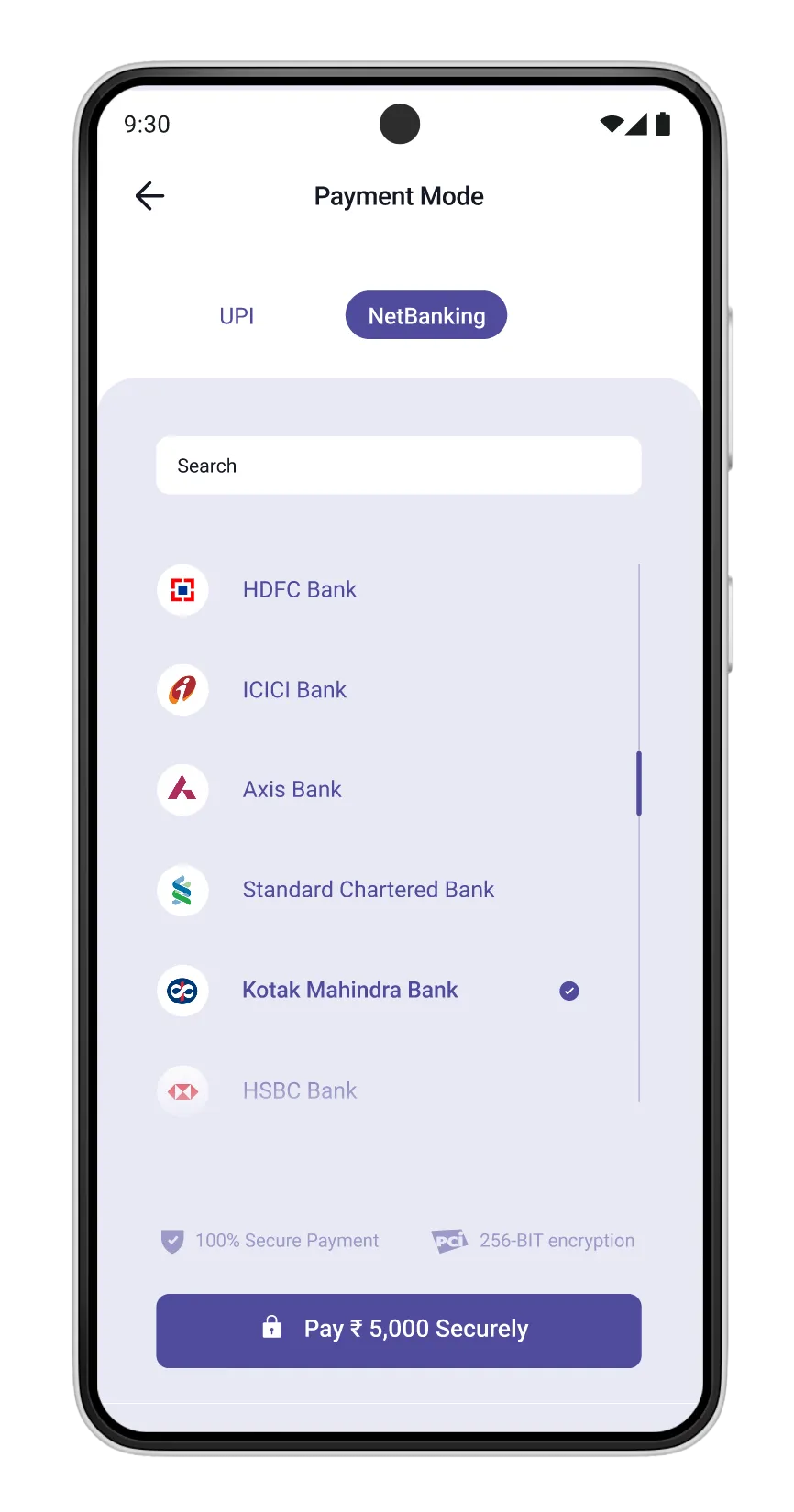
2
Payment Mode
Select Your Bank for FD Creation
Users choose their preferred bank partner for the fixed deposit. This flexibility respects user preferences while maintaining seamless integration with multiple banking partners.
Design Focus
Multiple bank options with clear logos
User Benefit
Choice and control over banking partner
3
Account Setup
Personalize Your Card
After issuance, users can customize their card experience, making the product feel uniquely theirs from day one. The personalization step reinforces ownership and emotional connection.
Design Focus
Minimal friction onboarding flow
User Benefit
One-stop solution for all requirements
4
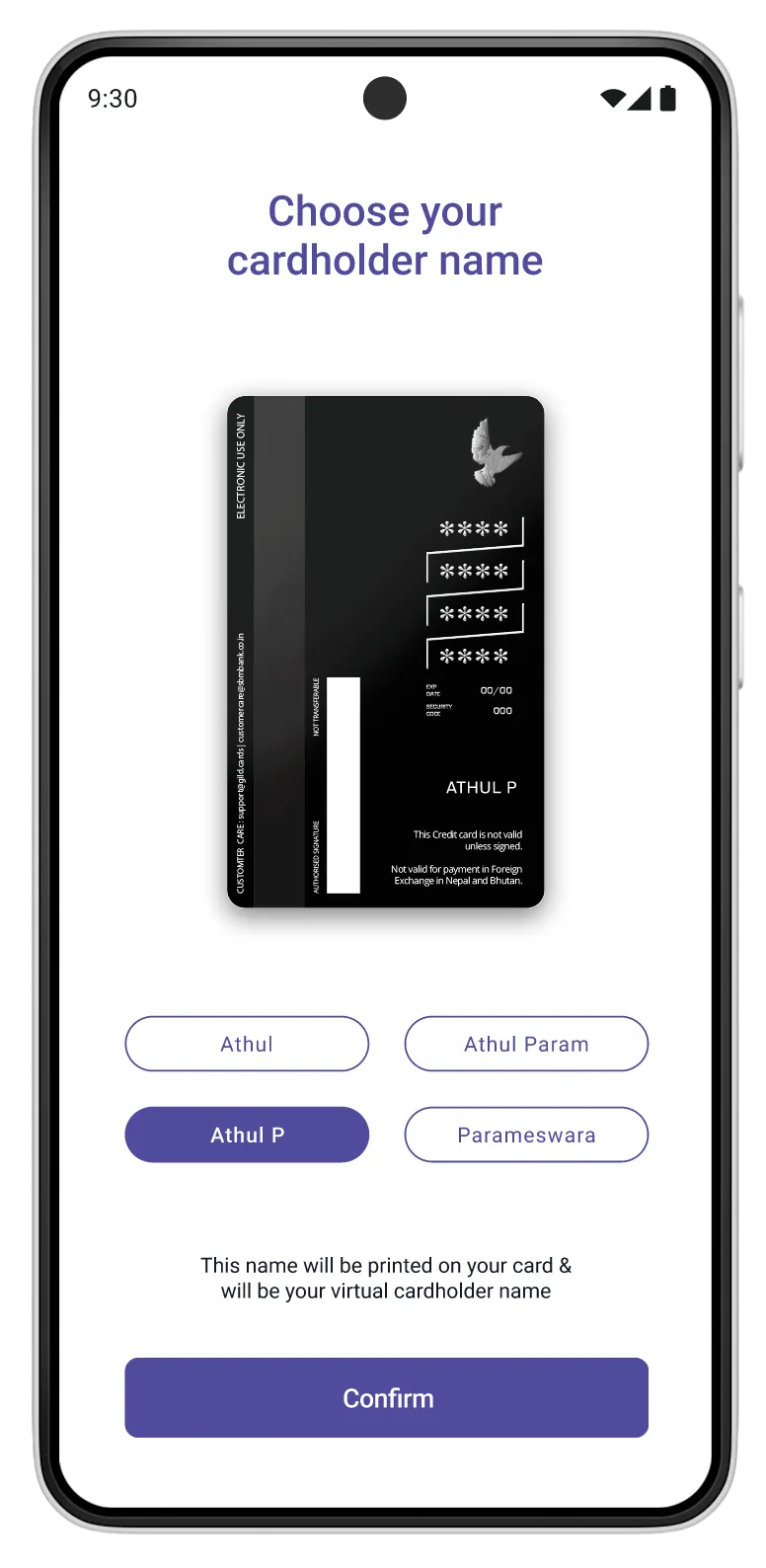
Application Success
Cardholder Name Selection
Before card activation, users select how their name will appear on the card. Providing predefined options reduces input errors while giving users a sense of ownership and personalization.
Design Focus
Error prevention with guided choice
User Benefit
Confidence that the printed name is correct
5
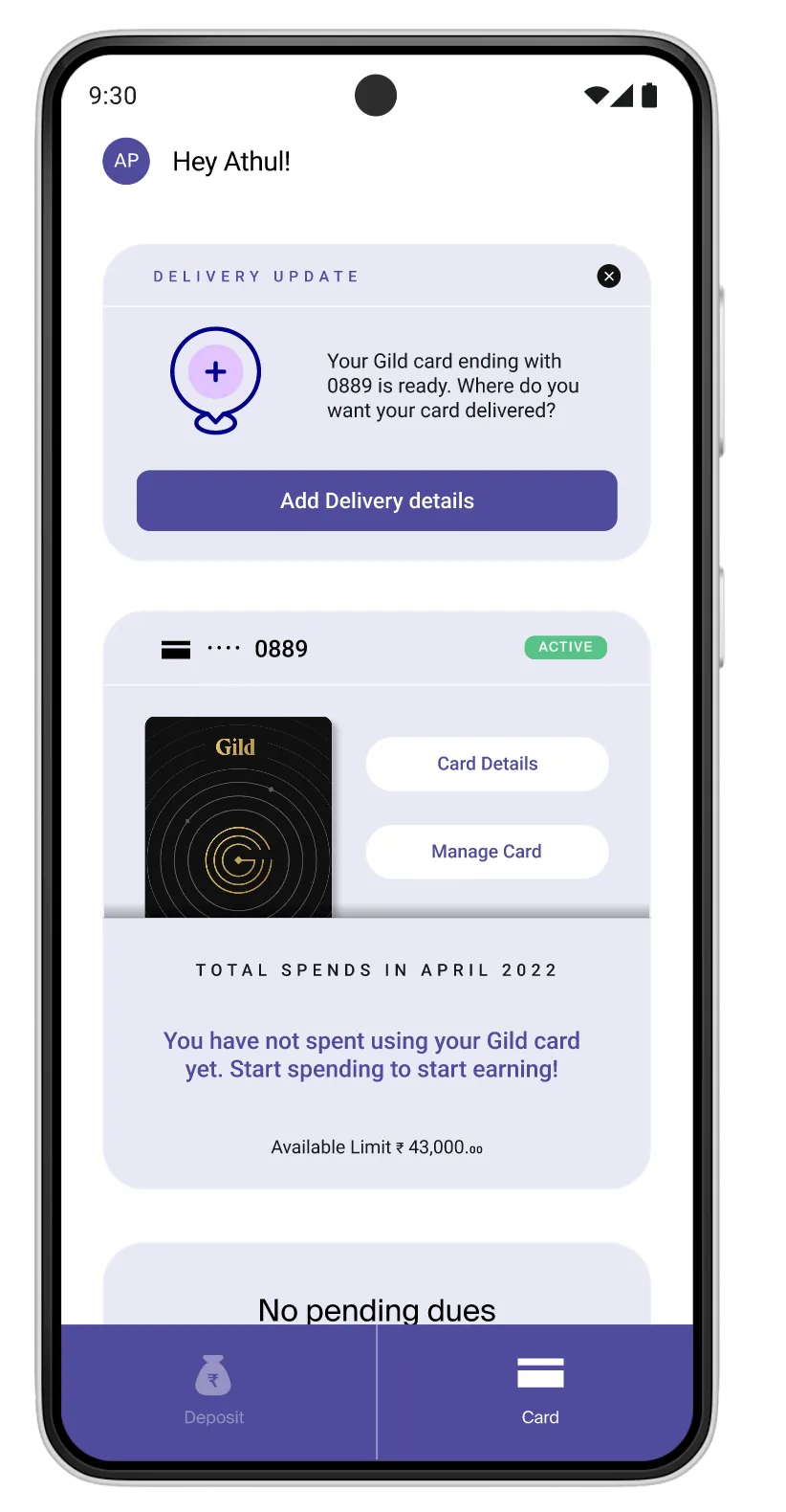
Delivery Tracking
Track Your Card Delivery
Real-time tracking keeps users informed about their card's journey. The visual timeline shows progress from approval to dispatch to delivery, reducing anxiety and support queries.
Design Focus
Visual progress with status updates
User Benefit
Transparency reduces support burden
6
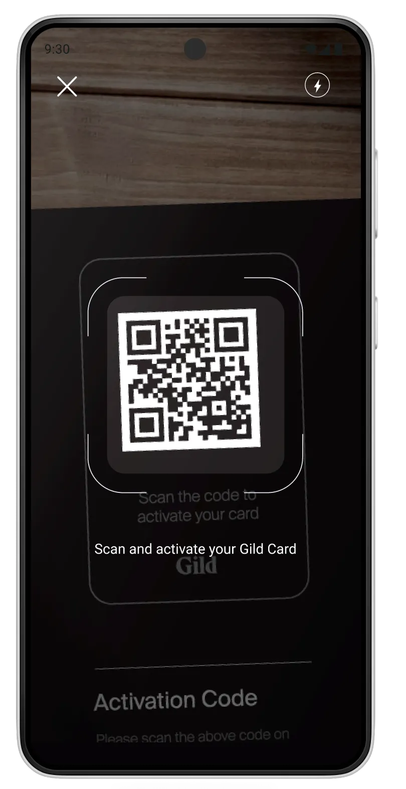
Card Activation
Quick QR Code Activation
Simple QR code scanning eliminates the need to manually enter long card numbers. This modern activation method is intuitive for agents and reduces errors during the setup process.
Design Focus
QR scan for quick activation
User Benefit
Error-free activation in seconds
7
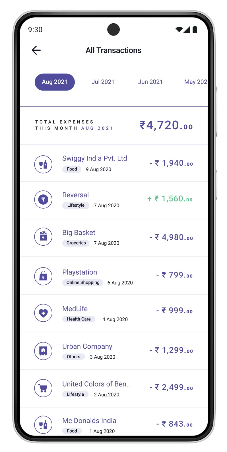
Transaction History
Complete Spending Overview
Users can view all their transactions with clear categorization and spending patterns. This visibility helps them understand their credit usage and builds financial awareness, key to long-term credit health.
Design Focus
Chronological list with categories
User Benefit
Financial awareness and control
8
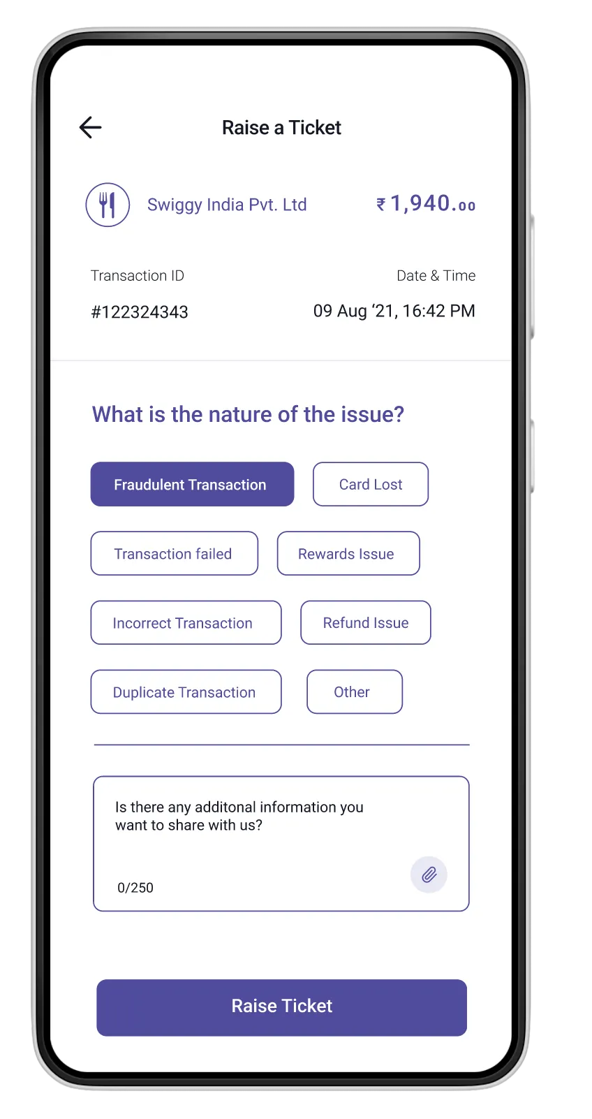
Support Center
Integrated Support System
Built-in support with categorized issue types makes it easy for users to get help when needed. The ticket system ensures accountability and tracks resolution, building confidence in the platform.
Design Focus
Categorized issues with ticket tracking
User Benefit
Quick resolution and accountability
Next


thecn.com
Designing a unified course browsing experience for multi-persona users with conflicting goals