Enterprise-SaaS
Web App
LMS
Designing a unified course browsing experience for multi-persona users with conflicting goals
Transformed a fragmented legacy learning platform (est. 2011) into a cohesive, role-aware ecosystem aligning student, various instructors, and admin workflows into a scalable global experience.
Industry
Edtech
Role
AI UI/UX Designer (Given title)
Owned end-to-end product design
Timeline
November 2025
Live in December 2025
Team
UX Designer (me), 1 Product Manager, 3 Engineers
Overview
Context of the application
What Product?
A social learning platform for universities and organizations to deliver courses, enable collaboration, and help learners build lifelong digital portfolios.
Assume: LinkedIn + Facebook Groups + Google Classroom combined into one academic ecosystem.
Who is it for?
Universities, colleges, training programs, students, and instructors globally, enabling coursework management, peer interaction, discussions, and public showcasing of academic work in a unified environment.
Purpose of the project?
CourseNetworking (Estd. 2011) aimed to boost institutional client acquisition in 2026. The legacy platform no longer met the needs of students, instructors, and administrators. This project redesigned a unified, scalable experience to improve adoption, engagement, and readiness for enterprise expansion.

CourseNetworking
Learning Management
System


College/
Universities

Training
Institutions

Individual
Instructor

Students / Learners

goal
Goal of the revamp
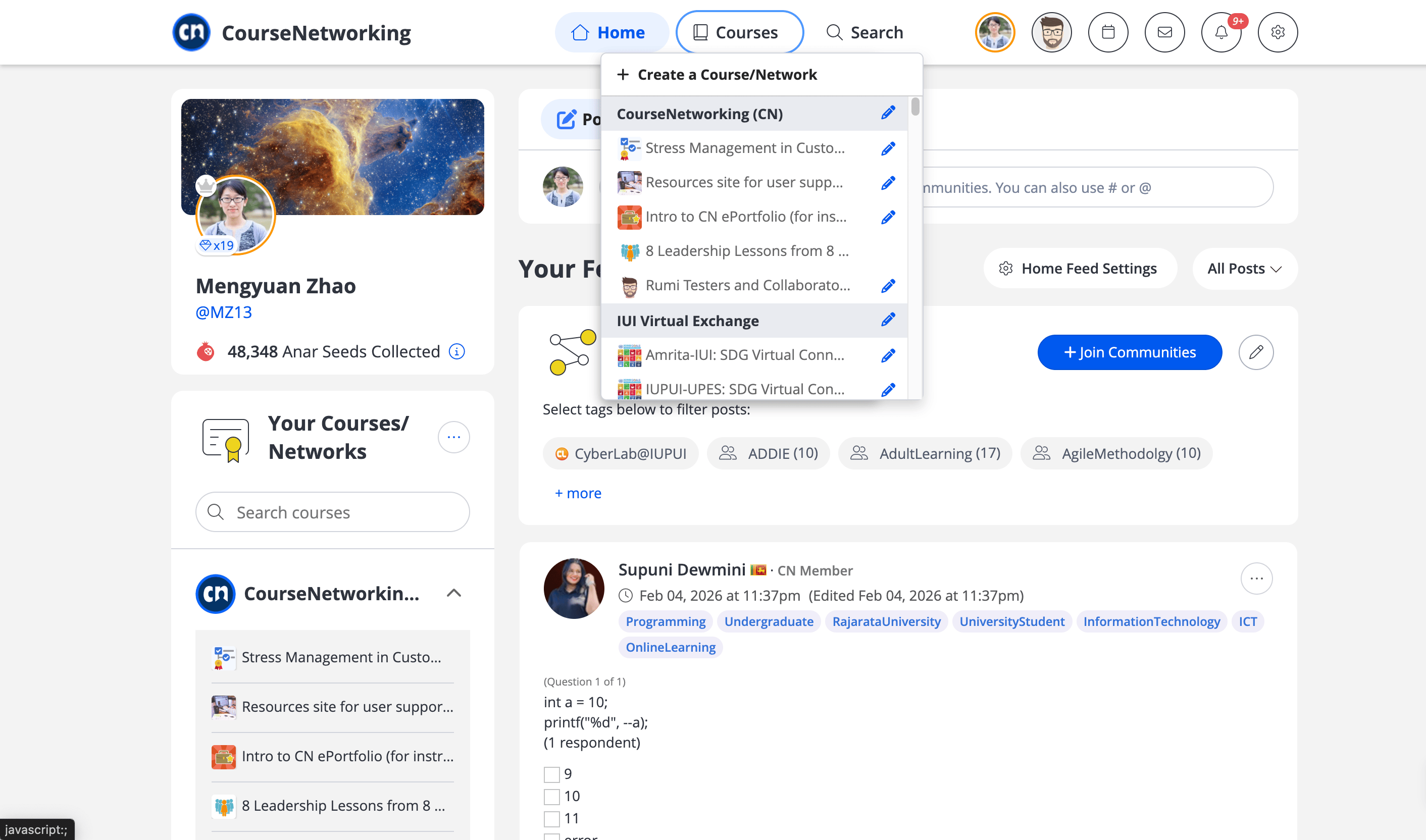
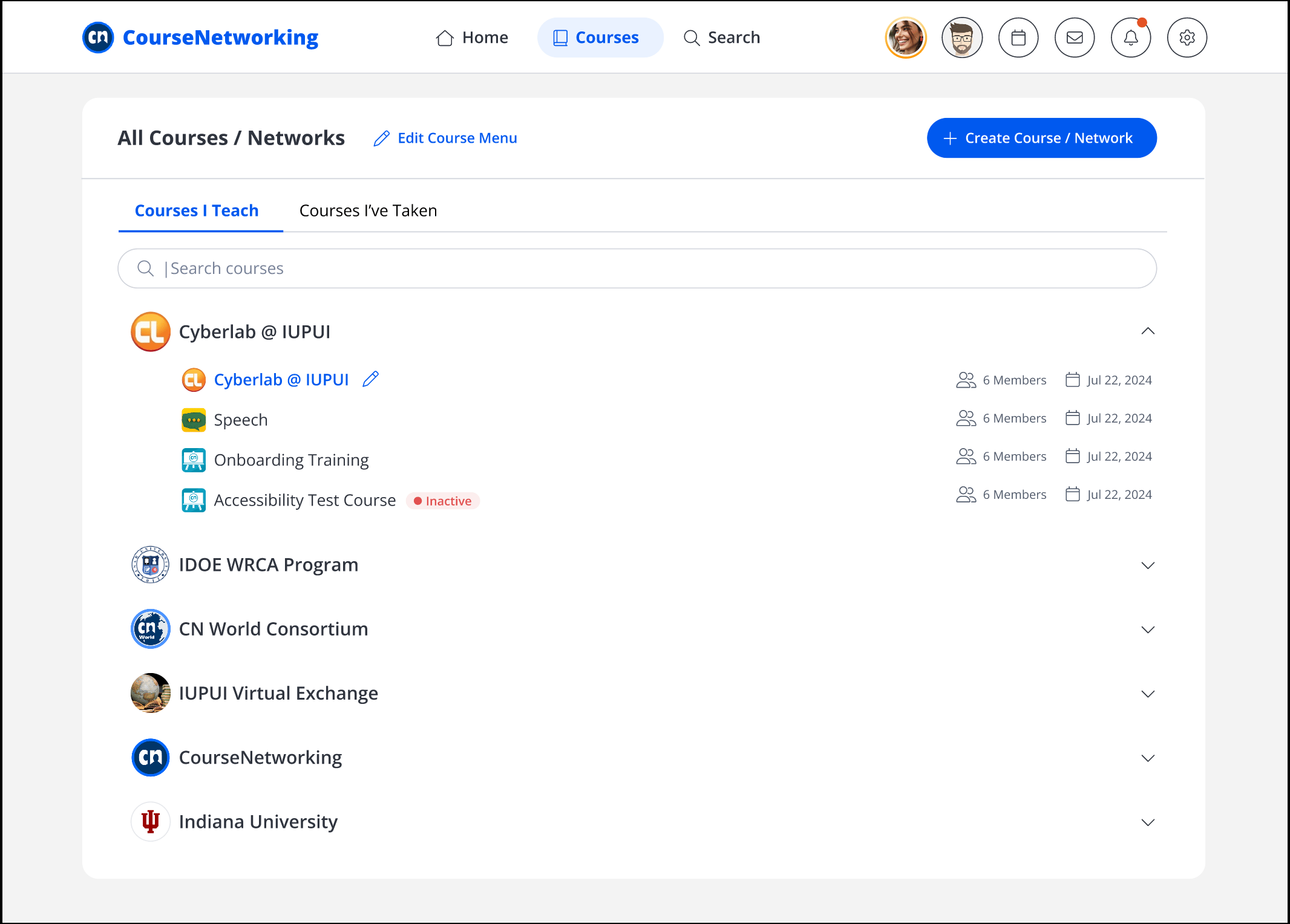
To accommodate institutional growth, we transitioned the course navigation from a cramped, habit-driven dropdown to a dedicated, full-screen management hub. The original "quick-access" menu had become a bottleneck, forcing users to scroll through hundreds of courses and creating significant cognitive fatigue. By shifting to a centralized dashboard, we replaced tedious manual searching with a scalable architecture featuring robust filtering and clear categorization. This redesign successfully moved users from inefficient scrolling habits to a streamlined workflow that handles high-density data with ease.
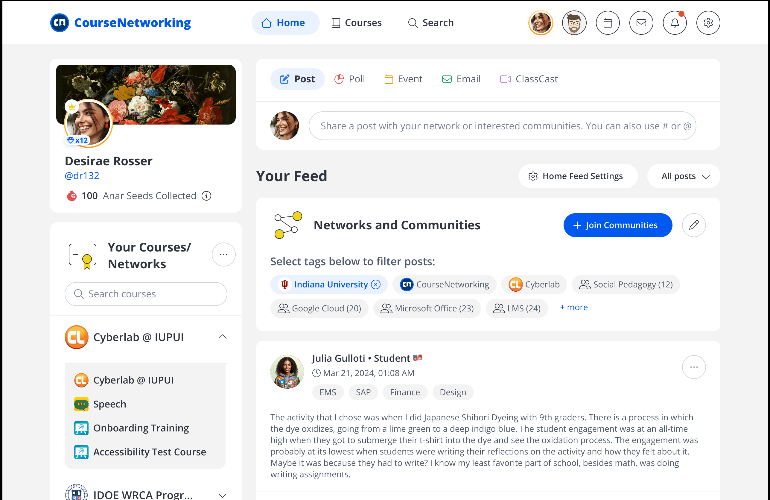
Old version
Scroll-heavy course selection popup


thecn.com
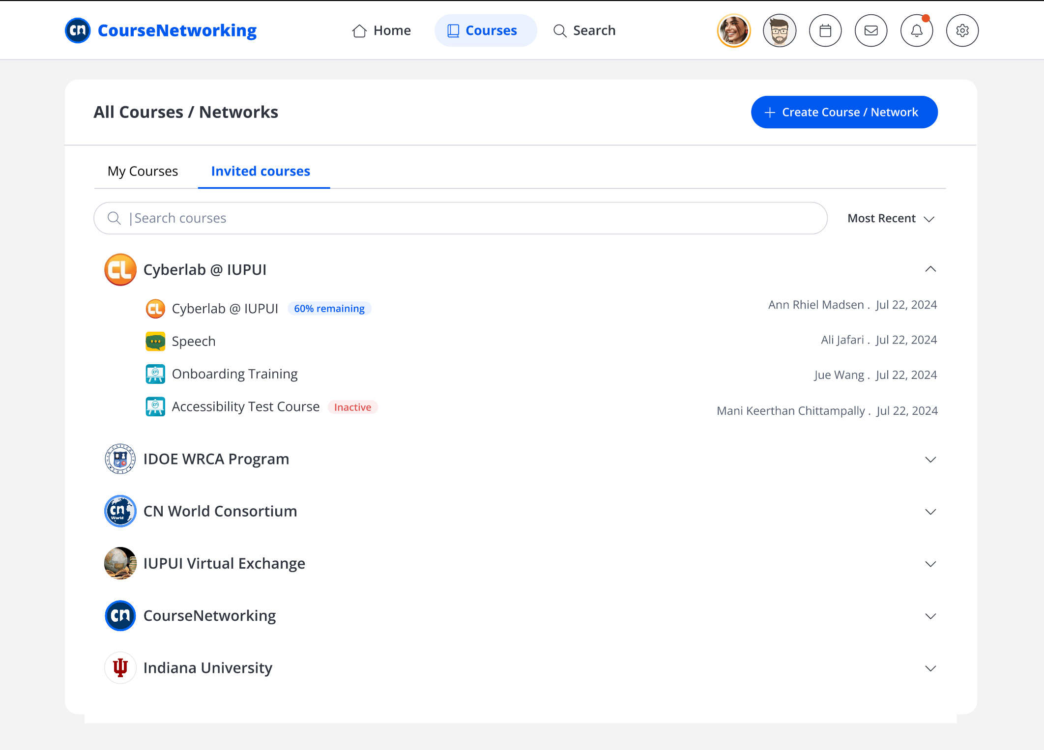
New version
Dedicated course management hub


thecn.com
design process
01
Understanding problem through stakeholder interview
02
Persona re-evaluation
03
Ideating possible solutions
Research, Tradeoff's, Iterations
High-Fidelity Prototypes
04
Dev Handoff
UAT
05
Go Live
Illustration of user behavior across typical events
Problem
Problem in the system
As user complexity increases, so does frustration. Simple browsing works for students, but institutions managing hundreds of courses face critical pain points.
User
Type
Key Insight
Frustration


Students / Learners
Basic browsing works fine for simple course discovery
1 need

Individual Instructor
Managing multiple courses becomes cluttered quickly
3 needs


Training Institutions
Dozens of courses need filtering to stay organized
4 needs


Universities
Hundreds of courses require advanced tools like priority ordering
5 needs


thecn.com
thecn.com


thecn.com
Missing: Advanced filtering • Drag-to-reorder priority
Available: Create/edit courses • Search and discovery
What works and what's missing
Current System Capabilities
Core Activity: Primary browsing and learning activity works well for basic user needs
User Problem
Critical actions are currently fragmented across multiple touchpoints, forcing power users (Universities and Institutions) into constant context switching. This fragmentation creates significant navigation fatigue and prevents efficient, high-volume management.
Business Problem
As high-value institutional clients are the primary revenue drivers, a cumbersome interface creates a barrier to acquisition and retention. Improving the UX is no longer just a "nice-to-have" but a strategic necessity to close enterprise-level deals and stay competitive.
Why?
The platform is in a transitional phase, migrating from legacy infrastructure to a modern UX framework. This overhaul is essential to support the next generation of "Agentic AI" capabilities, which require a consolidated and streamlined data architecture to function effectively.
design approach
Final Design
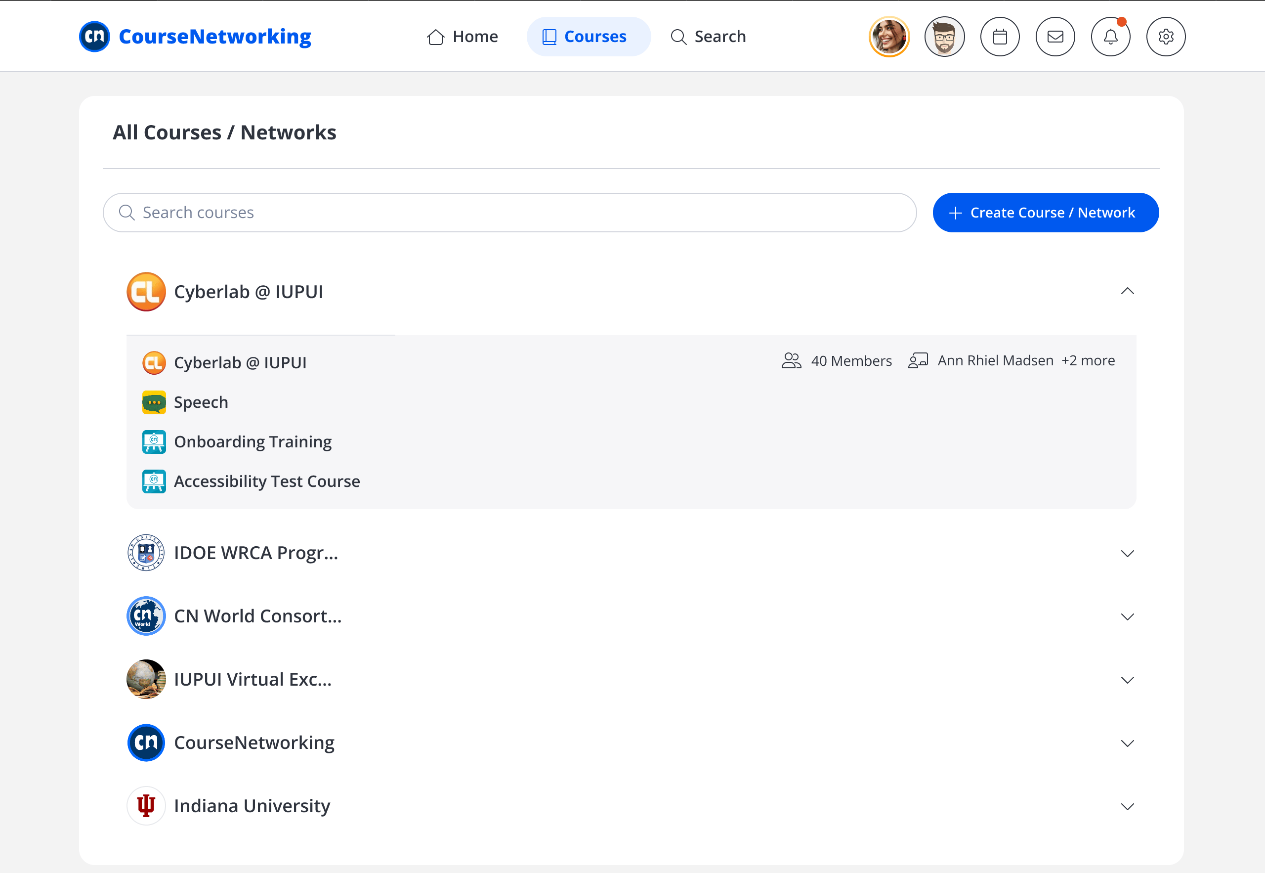
Instead of scattering course management tools across multiple pages—forcing users to constantly context-switch, the solution consolidates everything into a single, unified command center. All critical actions now live in one place, dramatically reducing cognitive load for power users managing hundreds of courses.
Course menu(Drag & Adjust course priority)
Create new course
Course filtering
Course details & creation date


thecn.com

Edit course


Search courses

AAA
5+ separate pages, constant navigation, high mental overhead
Before
Single dashboard, zero context switching, instant access to all tools
After
Universities can now manage complex curricula efficiently at scale
Impact
design decisions
What didn't work
Research insights, constraints, tradeoffs, and iterations
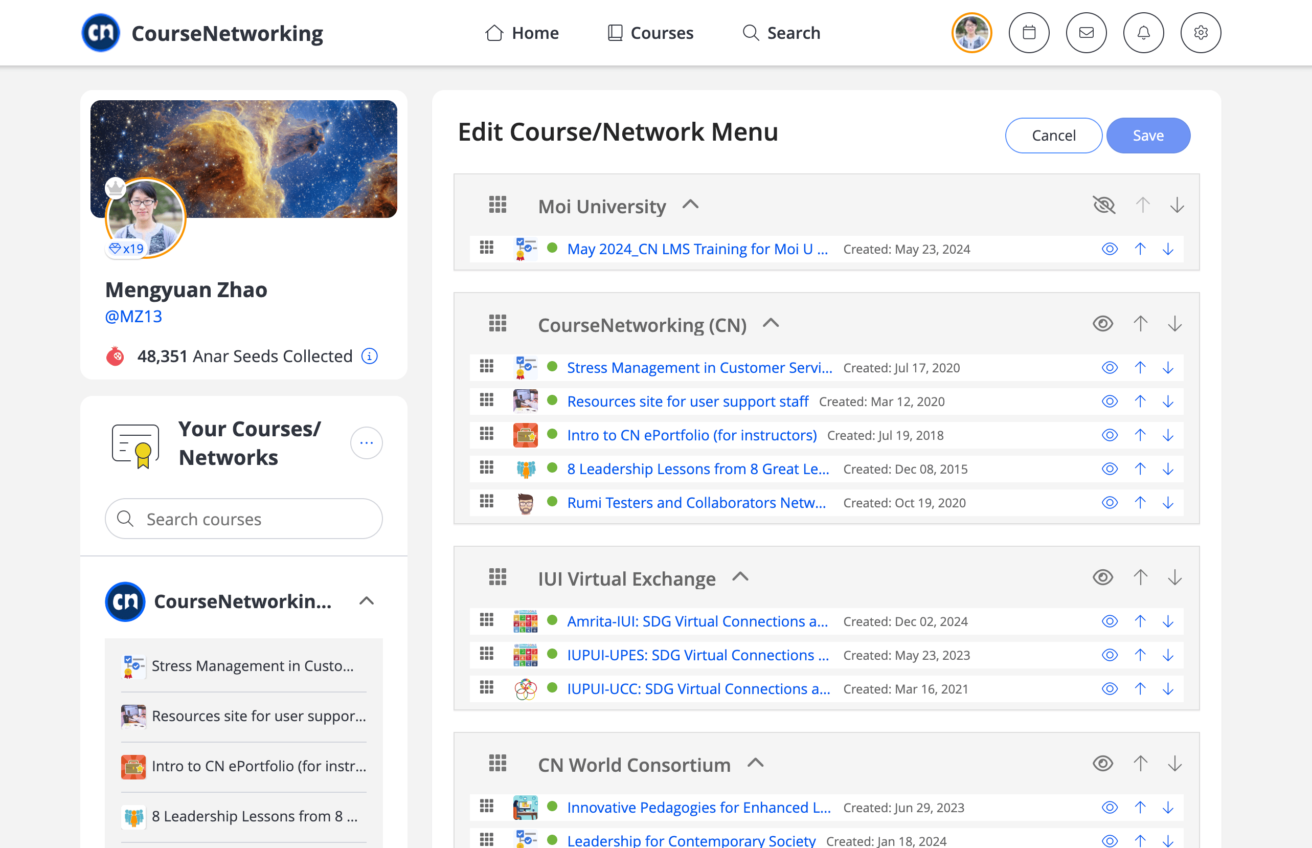
The 'Create Course / Network' action is losing visual prominence when clustered with secondary functions.Feedback from power users indicates that member metadata is unnecessary clutter and should be removed from this view.
Developing a robust filtering tool was deprioritized for this sprint due to immediate resource constraints.The current ML model supports binary status tracking (Active/Inactive), though it lacks granularity for specific percentage completion metrics.


thecn.com


thecn.com
final prototype
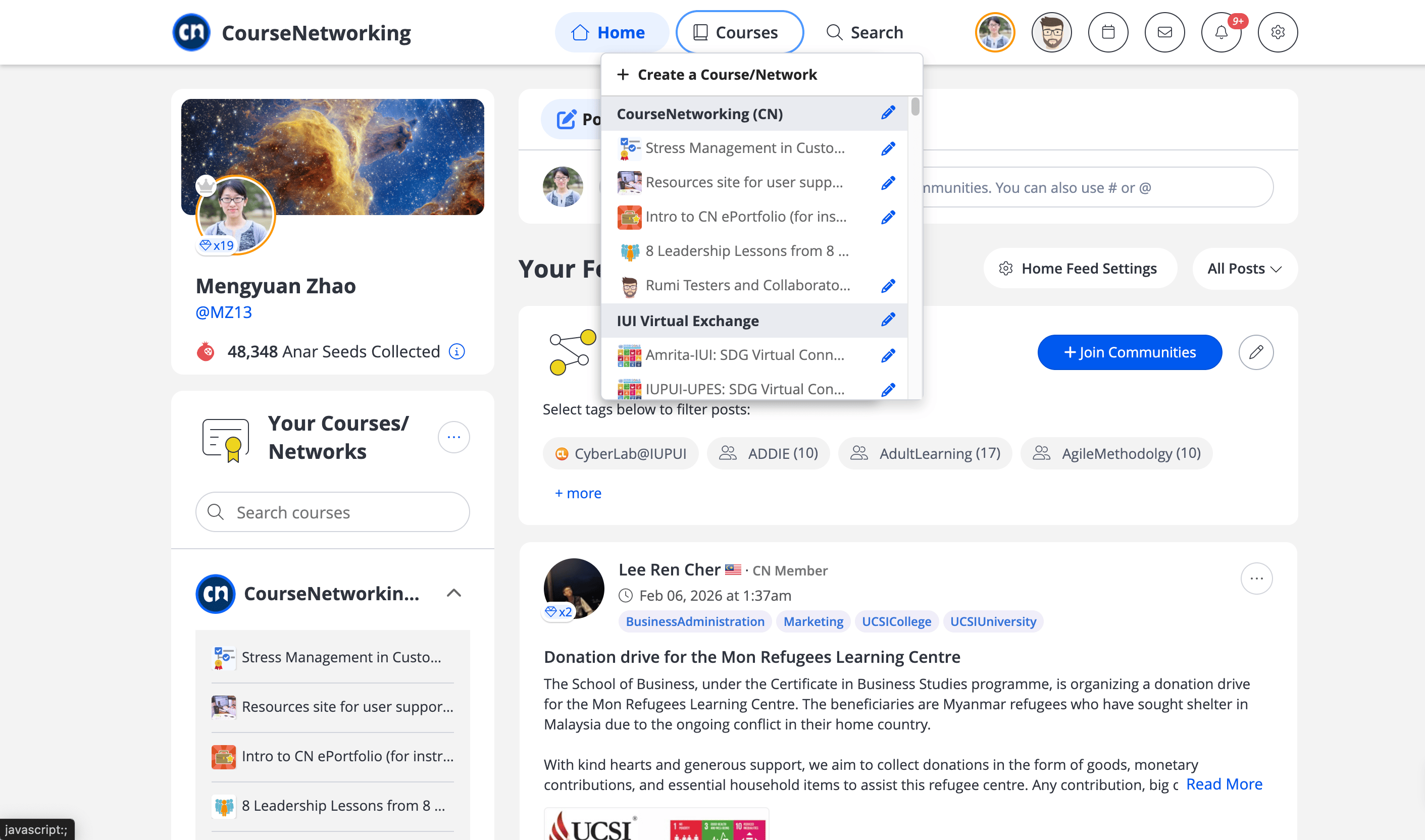
Just a glimpse from the production
user testing insights
What did our users expected?
We involved users to test our product after the launch
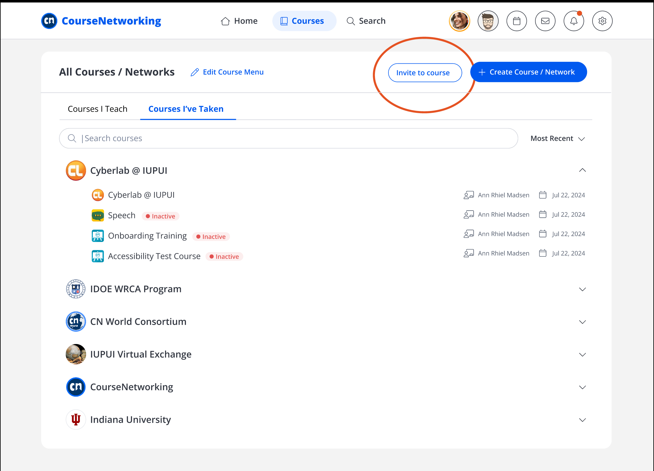
User testing revealed a need for "Invite to Course" functionality—planned for the next sprint iteration.
Developing a robust filtering tool was deprioritized for this sprint due to immediate resource constraints.The current ML model supports binary status tracking (Active/Inactive), though it lacks granularity for specific percentage completion metrics.
thecn.com
Next


$4,975.00
(+3.90%) today


Karl
Reimagining P2P payments with blockchain infrastructure to enable free, instant transfers.